
As you look at my short articles about the changes to the Hero Action Cards (or on the full sets in the Proto Upgrade page) you might think that the size of the font and icons looks smaller. Well … that is **MY** fault. True. I don’t have cool graphic illustration tools at my disposal. The images of the final Action Cards that I have include the area of the card that is TRIMMED! There probably is a name for this:) They make the image much larger so that when it is trimmed, even if it is cut slightly off, it will still look good! I am thinking that this extra on each card might actually make the card image 12% larger … so if I print that LARGER image on a NORMAL size card I will be REDUCING it … making it SMALLER! So … look forward to the action cards in the final game having a much larger look to the images, icons and fonts!
Here … let’s see if I can show this visually. Here is a final Action Card with all the trim area included. Next I marked where the card will likely actually be cut. This shows how much trim area was included:
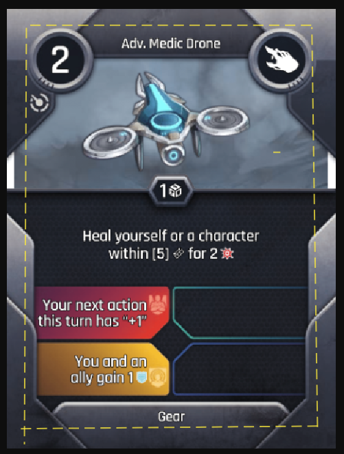
Or maybe a better way to visualize it would be with a change in the font size. When I reduce the size of an actual Action Card image that includes the trim area, I reduce it enough that the font size is probably at least 1 point smaller (likely even smaller than that). Here is another visual for you to see how this seemingly small difference can actually make a HUGE difference when glancing at an Action Card. Consider the font being 1 or 2 points larger … and wouldn’t it be way way easier to read?
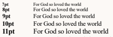
So … I definitely look forward to that slight (but significant) increase in the final game!
Maybe I can try to trim off the excess in the card images. But it would take ME a long time since I have no easy way to do it :(
See more First Looks and Updated Info using this master list (close to two dozen already):
=> Take A Look


Leave a comment